The digital landscape has undergone transformative changes over the past few decades, reshaping how websites are designed, developed, and experienced. This evolution in web design reflects the dynamic nature of technology and user behavior, leading to the advent of Responsive Web Design (RWD) as a cornerstone of modern web development practices.
Brief Overview of the Evolution of Web Design
Web design has journeyed from simple, text-based pages to complex, interactive experiences. In the early days of the internet, websites were primarily designed for desktop computers with little consideration for varying screen sizes or user environments. As mobile devices gained popularity, the need for adaptable and flexible web designs became evident. This led to the development of various techniques to create mobile-friendly sites, including separate mobile sites and adaptive design. However, these solutions often resulted in increased maintenance costs and fragmented user experiences.
The concept of Responsive Web Design emerged as a holistic approach to address these challenges, emphasizing fluid layouts, flexible images, and media queries. This marked a significant shift in how designers approached web development, focusing on creating websites that could adapt seamlessly across a wide range of devices from desktops to smartphones.
Definition of Responsive Web Design (RWD)
Responsive Web Design is a web development approach that creates dynamic changes to the appearance of a website, depending on the screen size and orientation of the device being used to view it. RWD uses a combination of flexible grids and layouts, images, and an intelligent use of CSS media queries. When a user switches from their laptop to a tablet, the website should automatically switch to accommodate for resolution, image size, and scripting abilities. This eliminates the need for a different design and development phase for each new gadget on the market.
Importance of RWD in the Current Digital Landscape
In today's digital age, where internet traffic from mobile devices surpasses that from desktops, RWD is not just a trend but a fundamental component of web design and development. It enhances user experience by providing a consistent and seamless interface across devices, improves site accessibility, and contributes significantly to SEO efforts. Google's mobile-first indexing and the rising expectations of users for fast, accessible web experiences on any device underscore the critical role of RWD in the current digital ecosystem.
Moreover, with the increasing diversity of screen sizes—from smartwatches to large desktop monitors—RWD ensures that websites are future-proofed against the continuous evolution of technology. By adopting responsive web design practices, businesses and developers can create websites that are both versatile and user-friendly, ensuring they remain competitive and relevant in the ever-changing digital landscape.
To further explore the importance of optimizing your website's design and content for search engines, consider reading our insights on how to create an SEO content strategy, which complements the principles of responsive web design by ensuring your site is not only user-friendly but also ranks well on search engine results pages.
Responsive Web Design represents a significant advancement in how websites are constructed and interacted with, reflecting an ongoing commitment to user-centric design and accessibility. As we delve deeper into the technical aspects, benefits, and best practices of RWD, it's clear that its implementation is crucial for anyone looking to succeed in the digital space.
Understanding Responsive Web Design
Responsive Web Design (RWD) is a web development strategy aimed at creating sites to provide an optimal viewing experience—easy reading and navigation with a minimum of resizing, panning, and scrolling—across a wide range of devices. At its core, RWD is about flexibility and adaptability. It involves a mix of layouts, images, and intelligent CSS media queries to ensure that as the user's device environment changes, the website dynamically adjusts to fit those specific parameters.
The Concept of Responsive Web Design
The concept of RWD is rooted in the idea that design and development should respond to the user's behavior and environment based on screen size, platform, and orientation. This practice consists of a mix of flexible grids and layouts, images, and the use of CSS media queries to automatically adapt the website's layout to the viewing environment.
Explanation of Fluid Grids
Fluid grids are a cornerstone of RWD, allowing layouts to resize dynamically to fit the screen width of the viewing device. Instead of designing a webpage with absolute units like pixels or points, fluid grids use relative units like percentages or ems. This means that a column designed to take up 50% of a page width on a desktop monitor will also take up 50% of the screen on a mobile device, ensuring consistency in design proportion across devices.
- Example of Fluid Grid Implementation:
- If the main content area is designed to be 60% of the screen width and the sidebar 40%, these proportions remain consistent regardless of the screen size.
Use of Flexible Images and Media
Just as fluid grids adapt to the screen size, flexible images and media scale within their containing elements to ensure they are not displayed outside their container. The goal is to ensure that images and other media types are fully visible and clear, regardless of the device used to view the content.
- CSS Technique for Flexible Images:

This CSS code ensures that images and videos are never wider than their container but retain their original height-to-width ratio.
Importance of CSS Media Queries
CSS media queries extend the flexibility of RWD by allowing the webpage to use different CSS style rules based on characteristics of the device the site is being displayed on, most commonly the width of the browser.
- Example of a CSS Media Query:

This media query applies a light blue background color to the body of the webpage when the browser window is 768 pixels wide or smaller, typically targeting tablets and mobile devices.
Differences Between Responsive and Adaptive Design
While both responsive and adaptive designs aim to improve the user experience across different devices, they differ in their approach. Responsive design is fluid and adapts to the size of the screen no matter the device. In contrast, adaptive design uses static layouts based on breakpoints which don't respond once they're initially loaded. Adaptive layouts can target specific device sizes but don't offer the same fluidity as responsive designs.
The Role of Mobile-First Design in RWD
Mobile-first design is an approach where designing for the smallest screen and working your way up to larger screens is prioritized. It's a fundamental principle in RWD, emphasizing the importance of optimizing content for mobile viewing before adjusting for tablets or desktops. This approach ensures that all users have a great experience, no matter their device, prioritizing performance and user needs.
- Mobile-First Benefits:
- Improved user experience on mobile devices
- Performance optimization
- Enhanced mobile SEO
For more insights on optimizing your web content for search engines, our article on Keyword Optimization for Higher Search Rankings offers valuable strategies that align well with responsive web design principles, ensuring your content is not only accessible across devices but also well-positioned in search results.
Responsive Web Design represents a shift towards more flexible, user-friendly web development practices. By understanding and implementing fluid grids, flexible images and media, CSS media queries, and adopting a mobile-first approach, web developers can create websites that provide an optimal viewing experience across a multitude of devices, thereby enhancing user engagement and satisfaction.
The Technical Aspects of Responsive Web Design
Delving into the technical aspects of Responsive Web Design (RWD) reveals the mechanisms that allow websites to adapt seamlessly across different devices. This section explores fluid grid systems, flexible images and media, and CSS media queries—three pillars that support responsive web environments.
Fluid Grid Systems
Explanation of How Fluid Grids Work
Fluid grid systems are based on proportional layout principles rather than fixed units (like pixels or points). This approach allows elements within a web design to resize in relation to one another depending on the screen size. For example, if a grid is designed to have a column that takes up 50% of the page width, it will maintain this proportion whether viewed on a desktop, tablet, or smartphone.
- Proportional Layouts: Instead of fixed sizes, elements are sized in percentages. The layout adapts to the screen width, ensuring consistency in design regardless of the device.
Implementing Fluid Grids in CSS
Implementing fluid grids requires setting up container elements with percentage-based widths. Here's a simplified example:
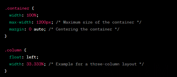
This CSS code creates a container that adjusts to the width of the device's screen, with columns that resize to keep their relative widths.
Flexible Images and Media
Techniques for Making Images and Media Responsive
To ensure that images and media elements are not distorted or oversized on different devices, they must be made flexible. This can be achieved through CSS by setting the max-width property of images to 100%, allowing them to scale down according to the containing element.
- CSS Code Snippets for Flexible Media:

This snippet ensures that images and videos scale correctly within their parent elements, maintaining their aspect ratio without exceeding the container's width.
CSS Media Queries
Basics of Media Queries
Media queries are a feature of CSS that allow content to adapt to various conditions such as screen resolution, device orientation, and window size. They enable designers to apply different styles based on the specific characteristics of the device viewing the website.
- Structure of a Media Query:

This example changes the background color for screens smaller than 600 pixels wide, targeting smaller devices like smartphones.
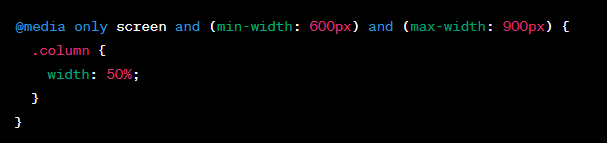
Examples of Media Query Usage for Different Screen Sizes
Media queries can target a range of devices with different widths, orientations, and resolutions. Here's how they can be applied:
- Tablets (e.g., devices with widths between 600px and 900px):
- Large Devices (e.g., widescreen monitors above 1200px):

These examples demonstrate how CSS media queries can be used to adjust website layouts for optimal viewing across a variety of devices, enhancing the overall user experience.
By mastering the technical aspects of Responsive Web Design—fluid grid systems, flexible images and media, and CSS media queries—web developers can create more accessible, engaging, and user-friendly websites. For businesses looking to improve their online presence in specific regions, incorporating RWD with local SEO strategies can significantly increase visibility. A resourceful read on optimizing for local search can be found in our article on Local SEO strategies, which provides comprehensive guidance on enhancing your website's performance in local search results.
Benefits of Responsive Web Design
Responsive Web Design (RWD) is more than a technical solution for website adaptability—it's a strategic approach that offers multiple benefits, from enhancing the user experience to improving search engine rankings. Here, we'll delve into the advantages of implementing RWD, supported by data points and strategic insights.
Enhanced User Experience Across Devices
One of the primary benefits of RWD is the provision of a seamless viewing experience across different devices. Users expect websites to function flawlessly, whether they're accessing them from a desktop, a tablet, or a smartphone. Responsive design ensures that content is easily navigable, readable, and accessible, regardless of screen size or resolution.
- Key Points:
- Consistency: The same content and visual layout are maintained across devices, fostering familiarity and ease of use.
- Flexibility: Content dynamically adjusts to fit the screen, eliminating horizontal scrolling and zooming issues.
- Speed: Responsive websites tend to load faster on mobile devices, reducing wait times for users.
Improved Search Engine Optimization (SEO)
Google has explicitly stated that responsive design is its preferred method for mobile configuration, and it plays a significant role in SEO rankings. A responsive website has one URL and the same HTML across devices, which makes it easier for Google to crawl, index, and organize content. Moreover, mobile-first indexing means Google predominantly uses the mobile version of the content for indexing and ranking.
- SEO Advantages:
- Lower Bounce Rate: A mobile-friendly website encourages users to stay longer, reducing the bounce rate—an important ranking factor.
- Increased Page Speed: Page load time is a known ranking factor, and responsive designs load faster on mobile devices.
- Avoiding Duplicate Content: With a single website for all devices, you avoid the risk of content duplication, which can negatively impact SEO.
For a deeper dive into enhancing your website's search engine visibility, explore our insights on Mastering On-Page SEO, which complements responsive design principles by ensuring that your site is optimized for both users and search engines.
Lower Maintenance Costs Compared to Separate Mobile Sites
Maintaining one responsive website is significantly more cost-effective than managing separate sites for desktop and mobile usage. Initially, the investment in RWD might be higher than creating a standalone mobile site, but the reduced costs in maintenance, content management, and updates lead to significant savings over time.
- Cost-Saving Aspects:
- Unified Analytics: Monitoring and analytics are streamlined, as you're dealing with a single site, simplifying the process of tracking user journeys and behaviors.
- Simplified Content Management: Updating content needs to be done only once, saving time and resources.
Increased Conversion Rates and Lower Bounce Rates
Responsive design can lead to higher conversion rates and lower bounce rates. A website that looks good and works well on any device provides a better user experience, which can encourage visitors to take desired actions, such as making a purchase or signing up for a newsletter.
- Impact on Conversions:
- Improved Navigation and Usability: Users are more likely to engage with and convert on a website that offers an intuitive and frictionless experience.
- Trust and Credibility: A professionally designed, responsive website enhances the perception of quality and reliability, encouraging users to feel more confident in taking conversion actions.
The strategic implementation of responsive web design not only elevates the user experience but also aligns with essential digital marketing objectives, including SEO performance, cost efficiency, and conversion optimization. By embracing RWD, businesses can ensure their online presence is robust, engaging, and capable of meeting the evolving demands of the digital landscape. For businesses aiming to enhance their local online presence, incorporating responsive design with localized SEO strategies is vital. Discover more on this by exploring our dedicated insights on local SEO practices within Local SEO strategies, ensuring your business stands out in local search queries.
Challenges of Implementing Responsive Web Design
While the benefits of Responsive Web Design (RWD) are clear, its implementation is not without challenges. These obstacles require careful planning, testing, and optimization to ensure that the end product provides a seamless user experience across all devices. Here, we delve into the complexities of RWD, including design intricacies, performance optimization, and the necessity of extensive testing.
Design Complexity and Planning
Creating a responsive website involves a level of complexity significantly higher than that of a standard, fixed-width design. Designers and developers must consider a variety of screen sizes, input methods, and browsing contexts.
- Key Planning Considerations:
- Fluid Layouts: Designing layouts that can adapt to an unknown number of screen sizes requires a shift from pixel-perfect design principles to a more fluid, adaptable approach.
- Content Hierarchy: Prioritizing content based on device size and user context is crucial. What appears prominently on a desktop may need to be adjusted or reordered on mobile devices.
- Touch Interactions: Planning for touch interactions alongside mouse-based navigation can complicate the design process, requiring intuitive, touch-friendly interfaces.
To assist in navigating these complexities, engaging with a team that specializes in RWD can be invaluable. For businesses seeking expert guidance, our website content writing service includes consultation on structuring content for responsive designs, ensuring that your message remains clear and effective across all devices.
Performance Optimization for Faster Loading Times
Performance is a critical aspect of RWD, as mobile devices often have slower internet connections and limited processing power compared to desktops. Ensuring that your website loads quickly and efficiently on all devices is paramount.
- Strategies for Optimization:
- Image Optimization: Implementing responsive images with correct sizing can drastically reduce load times. Techniques such as lazy loading and using modern image formats (like WebP) are effective.
- Minimizing Code: Reducing CSS and JavaScript file sizes, through minification and concatenation, can significantly improve performance.
- Leveraging Browser Caching: By storing parts of the website locally in the browser, repeat visits can be much faster.
For further insights on enhancing your site's performance, our article on Boosting Website Speed provides detailed strategies and tips to ensure your responsive site meets user expectations for quick loading times.
Cross-Browser and Device Testing
Ensuring that a responsive website functions correctly across all browsers and devices is a considerable challenge. Differences in how browsers render CSS, handle JavaScript, or display fonts can lead to inconsistent user experiences if not properly addressed.
- Comprehensive Testing Approaches:
- Use of Testing Tools: Tools like BrowserStack and Selenium automate the testing process across a range of devices and browsers, identifying issues that might not be evident in a developer's environment.
- Real Device Testing: While simulators and emulators offer convenience, testing on real devices provides the most accurate insight into user experience, particularly for touch interactions and performance.
Addressing the challenges of RWD requires a blend of technical skill, creative design, and meticulous testing. By acknowledging and preparing for these hurdles from the outset, developers and designers can create responsive websites that offer exceptional user experiences, irrespective of the device or browser used to access them. For businesses aiming to optimize their online presence for local customers, understanding the nuances of responsive design is critical. Learn more about tailoring your website's content and design for local audiences by visiting our Local SEO Company page, offering specialized insights and services to maximize your impact in specific geographic markets.

Best Practices for Responsive Web Design
Adopting Responsive Web Design (RWD) is not just about making a website accessible on any device, but also about ensuring it provides a superior user experience. To achieve this, several best practices should be followed during the design and development process. These guidelines help in creating websites that are not only visually appealing across devices but also performant and accessible to all users.
Mobile-First Approach
Starting the design process with mobile devices in mind prioritizes content and functionality that are essential, given the limited screen real estate. This approach ensures that your website's mobile version loads quickly and is easy to navigate, enhancing the overall user experience and SEO.
- Advantages:
- Improved site performance on mobile devices.
- Better SEO, as Google uses mobile-first indexing.
- Ensures essential content and functionality are prioritized.
For businesses aiming to enhance their digital marketing strategy, incorporating a mobile-first approach in your website design is crucial. Explore our insights on creating effective mobile content strategies in our blog post dedicated to unlocking the power of blogging to attract new customers.
Using a Responsive Framework
Frameworks like Bootstrap or Foundation provide a set of pre-designed CSS and JavaScript components that are inherently responsive. Using these frameworks can significantly speed up the development process and ensure consistency across different browsers and devices.
- Benefits:
- Saves development time with pre-built components.
- Ensures a consistent foundation for responsiveness.
- Offers community support for troubleshooting.
Prioritizing Content Based on Device Viewports
Content should be structured to adapt to the size of the device's screen, ensuring that the most important information is immediately visible to the user. This might mean reordering or even hiding certain elements that are not crucial on smaller screens.
- Strategies:
- Use CSS Flexbox or Grid layouts to create fluid, multi-column layouts that can easily be adjusted based on screen size.
- Implement conditional rendering in your code to display content dynamically based on the viewport size.
Techniques for Optimizing Images and Media for Performance
Optimizing visual content is crucial for maintaining fast load times and a smooth user experience across all devices. Responsive images adjust in size based on the screen, reducing unnecessary data usage for smaller devices.
- Optimization Tips:
- Use tools like Adobe Photoshop or online compressors to reduce image file sizes without sacrificing quality.
- Implement the
srcsetattribute in<img>tags to provide multiple versions of an image for different screen resolutions. - Utilize modern image formats such as WebP that offer better compression and quality characteristics compared to traditional formats like JPEG or PNG.
For a comprehensive guide on improving your website's visual content, consider our article on Tips for Writing Awesome Website Content, which includes strategies for optimizing images and media to enhance your site's performance and user engagement.
Accessibility Considerations in Responsive Design
Ensuring your website is accessible to all users, including those with disabilities, is not just a best practice—it's a necessity. Responsive design should incorporate accessibility features to make the web more inclusive.
- Accessibility Features:
- Ensure text is readable without zooming and provide sufficient contrast between text and background colors.
- Use semantic HTML5 elements to structure content and ARIA (Accessible Rich Internet Applications) labels to improve screen reader compatibility.
- Make sure all interactive elements are easily navigable using a keyboard in addition to touch or mouse input.
Incorporating these best practices into your responsive web design process can significantly enhance the usability, performance, and accessibility of your website across all devices. For businesses looking to expand their reach in specific markets, understanding the nuances of RWD is crucial for success. Learn more about tailoring your online presence to meet the needs of your target audience by exploring our services in Local SEO and Web Design, where we provide specialized solutions to optimize your website for local search and user engagement.
Tools and Resources for Responsive Web Design
To effectively implement Responsive Web Design (RWD), designers and developers rely on a variety of tools and resources. These tools facilitate the creation, testing, and optimization of responsive websites, ensuring they meet the high standards required for today's web. Below, we explore some of the most popular frameworks, libraries, testing and debugging tools, and online resources for learning RWD.
Popular Frameworks and Libraries
Frameworks and libraries provide a foundation on which to build responsive designs, offering pre-defined grids, responsive classes, and components that can significantly streamline the development process.
- Bootstrap: One of the most popular HTML, CSS, and JS frameworks for developing responsive, mobile-first projects on the web. Bootstrap offers a comprehensive set of features for responsive layouts, including a grid system, responsive utilities, and pre-styled components.
- Foundation: A sophisticated responsive front-end framework from ZURB, Foundation is designed to be both flexible and extensible. It provides a rich set of components and utilities for building responsive websites, emails, apps, and more.
- Tailwind CSS: A utility-first CSS framework packed with classes like
flex,pt-4,text-center, androtate-90that can be composed to build any design, directly in your markup. Tailwind's approach is highly customizable, making it a favorite for developers who prefer building their design system.
For a deeper understanding of how these frameworks can enhance your web projects, consider exploring our comprehensive guide on Choosing the Right Framework for Your Website, which includes insights into selecting the best framework based on your specific needs and goals.
Testing and Debugging Tools
Ensuring your responsive design works across all devices and browsers is crucial. Here are some tools that can help you test and debug your designs:
- BrowserStack: An extensive tool for cross-browser testing, allowing developers to test their websites in hundreds of browser versions across various devices to ensure compatibility and responsiveness.
- Responsive Design Checker: A simple tool that allows you to quickly check how your website looks on different screen sizes by entering your site's URL.
- Chrome DevTools: Built directly into the Google Chrome browser, DevTools allows developers to edit pages on-the-fly and diagnose problems quickly, helping them build better websites, faster.
Online Resources and Tutorials for Learning RWD
The web is rich with educational content designed to help learn and master RWD. Here are a few resources that stand out:
- Mozilla Developer Network (MDN): MDN provides comprehensive documentation on all things web development, including detailed guides on responsive design principles and techniques.
- CSS-Tricks: This website offers a plethora of articles, tutorials, and videos on RWD, covering everything from basic concepts to advanced strategies.
- Udemy, Coursera, and Codecademy: These online learning platforms offer courses on RWD, taught by industry experts. Whether you're a beginner or looking to advance your skills, these platforms have something for everyone.
Leveraging these tools and resources can significantly ease the process of implementing responsive web design, ensuring that your projects are not only visually appealing but also functional across all devices. For those seeking to further enhance their website's SEO through effective content strategies, our insights on Creating an SEO Content Strategy provide valuable tactics and considerations that complement responsive design principles, ensuring your site is optimized for search engines and provides a great user experience.
Case Studies: Success Stories in Responsive Web Design
Example 1: A Major Retail Company
Overview: A leading retail company revamped its website with a responsive design, aiming to improve user experience and increase mobile sales. Prior to the redesign, the site had a separate mobile version, which led to inconsistent user experience and higher maintenance costs.
Implementation: The company adopted a mobile-first approach, utilizing a popular framework, Bootstrap, for its responsive features. The redesign focused on optimizing images, implementing fluid grids, and prioritizing content for mobile users.
Outcome: Post-launch, the company saw a 40% increase in mobile sales and a 25% decrease in bounce rate from mobile devices. The unified approach also reduced the time and resources needed for content updates and site maintenance.
Lessons Learned:
- The importance of a mobile-first approach in meeting the needs of the growing number of mobile users.
- How responsive design can lead to significant improvements in sales and engagement.
Example 2: A Local Non-Profit Organization
Overview: A small, local non-profit aimed to increase its reach and engagement by redesigning its website to be responsive. The original site was difficult to navigate on mobile devices, leading to a high bounce rate.
Implementation: The non-profit utilized WordPress with a responsive theme, focusing on accessibility and content prioritization. Efforts were made to ensure that donation forms and event information were easily accessible on all devices.
Outcome: The redesign led to a 50% increase in traffic and a 35% increase in donations received through the website. Mobile users reported a significantly better experience, leading to longer session durations and more page views.
Lessons Learned:
- Responsive design is crucial for non-profits looking to increase engagement and donations.
- Accessibility and ease of navigation can significantly enhance user experience and support organizational goals.
How to Get Started with Responsive Web Design
Planning a Responsive Design Project
- Define Your Goals: Understand what you aim to achieve with your responsive site—increased traffic, better engagement, sales growth, etc.
- Content Audit: Evaluate your existing content to determine what should be prioritized or adapted for smaller screens.
- Design Mockups: Start with mobile design mockups before scaling up to larger screens. Tools like Adobe XD or Sketch can be helpful.
Converting an Existing Site
- Assess Current Site: Use tools like Google's Mobile-Friendly Test to understand how your site performs on mobile devices.
- Implement Fluid Grids and Flexible Layouts: Adjust your site's layout to be more fluid, using percentages rather than fixed sizes.
- Optimize Images: Ensure images are optimized and utilize the
srcsetattribute for different resolutions.
Working with Teams and Tools
- Collaborate with Designers and Developers: Ensure there's a clear understanding of responsive principles among all team members.
- Consider Website Builders: Platforms like Squarespace, Wix, or WordPress offer responsive templates for those without coding skills.
The Imperative of Responsive Web Design
Responsive Web Design is no longer optional; it's essential for meeting the diverse needs of today's web users. The benefits—ranging from improved user experience to enhanced SEO and reduced maintenance costs—make a compelling case for adopting RWD practices. As technology continues to evolve, ensuring your website is responsive guarantees it remains accessible and engaging, no matter how or where it's accessed.
Further Reading and Resources
- Books: "Responsive Web Design" by Ethan Marcotte and "Mobile First" by Luke Wroblewski are excellent starting points.
- Websites: CSS-Tricks, Smashing Magazine, and A List Apart offer extensive articles, tutorials, and guides.
- Courses: Platforms like Udemy, Coursera, and Codecademy have comprehensive courses covering all aspects of RWD.
- Communities: Joining web design forums and groups on LinkedIn or Reddit can provide support and insights from fellow professionals.
Responsive Web Design is a journey, not a destination. As you embark on or continue this journey, leverage the wealth of resources and communities available. For businesses looking to enhance their online presence further, consider exploring our tailored services in SEO and content strategy, designed to complement your responsive design efforts and ensure your website not only looks great but also ranks well in search results.
FAQs
Find answers to common questions about the blog post.
The blog post is about [insert topic]. It provides valuable information and insights on [insert topic].
This topic is important because [insert reason]. It can help readers [insert benefit].
You can apply the information from the blog post by [insert action]. This will [insert outcome].
Yes, there are related resources available. You can find them [insert location]. They provide additional information and insights on [insert topic].
Yes, you can share the blog post with others. Use the social sharing buttons to spread the word and help others benefit from the information.
The blog is regularly updated with new content. Check back frequently for the latest articles and insights.
Yes, you can subscribe to the blog to receive notifications of new posts. Simply enter your email address and click 'Subscribe'.
We value your feedback. You can provide feedback by [insert method]. We appreciate your input and strive to improve our content.
Yes, the blog content is reliable. We ensure that our articles are well-researched and based on credible sources.
Yes, you can request a topic for future blog posts. Simply contact us with your suggestion.